
 This topic is locked

DroidRzr.com Official Site Logo FINALS!
Started by
tucstwo
, Dec 12 2012 06:01 PM
All Members Please Read Contest site logo
113 replies to this topic
#81

Papa T
-
- Members
-

- 188 posts
ROM Flashaholic
- Twitter:@JTHardee
- LocationDouglas (South Georgia)
- Current Device(s):Droid RAZR
Posted 14 December 2012 - 01:38 PM
I went with logo #4 but I would also go with logo #3 in blue. Favorite color is blue and guess what color my theme is...hehehe

#82
jtc303
-

- Superuser
-

- 406 posts
Droid Master
- LocationMA
- Current Device(s):Droid Razr Maxx HD, Samsung Galaxy Tab 2 10.1
Posted 14 December 2012 - 05:42 PM
i thought this as well..4 was nice, but i felt the lower case d doesn't quite belong on the logo when every other letter is capitalized.... From a design stand point of course.
MaxxHD

#83
Brutus06
-

- Dedicated Supporter
-
- 407 posts
Drunken Monk Brewery
- Google+:leereitz12@gmail.com
- LocationSouth Dakota
- Current Device(s):Bionic(retired), Lenovo Tablet, Moto G
Posted 14 December 2012 - 05:56 PM
4 was nice, but i felt the lower case d doesn't quite belong on the logo when every other letter is capitalized.... From a design stand point of course.
I think it would look nice if the first D was capital and the same size as the Z. That would set it apart from the rest of the word.
#84
altspeed
-

- Dedicated Supporter
-
- 654 posts
Director of National Stupidity
- Twitter:@Pat_Droid
- Google+:+Patrick Robinson
- LocationDallas Texas
- Current Device(s):RIP 8 & 16 GB Bionics, XT912 RAZR Maxx, XT907 RAZR M Current XT 1060 Motomaker Future Nexus 6
Posted 15 December 2012 - 11:24 AM
I'm down with getting rid of red too. #4 ROCKS! Who can make me one of those wicked sig plaques? something similar to tucstwo's in font, but different enough, that says something like "altspeed Team Bionic Dev Facilitator" eating windows phones for breakfast since the samsung blackjack!
"We are the People Verizon warned you about"
8 GB Bionic JB, 16 GB Bionic JB, Bionic Lapdock X2, Razr Maxx XT912 JB, Razr M XT907 JBLX
#85
Thach
-

- Administrator
-

- 2,364 posts
Motorola Fanboy
- Twitter:thach2639
- Google+:Thach26
- LocationGrand Forks ND
- Current Device(s):OG Droid, Droid X, Droid X2, Droid Razr, Droid Bionic, Droid Xyboard 8.2, Nexus 7
Posted 15 December 2012 - 11:46 AM
I am just throwing this out there. For all that have said something about us rigging this whole thing because of the styles used, come on back to reality. Nothing has been rigged and its insulting to even think that. There was a open thread for all to see where the submissions were made. For all those picking based on color, your jeopardizing this whole thing. I believe that most I used red and black for colors because well, that's the color scheme that comes to mind when most think of the Droid line. I know that we have expanded from that line to other devices but we have to face the facts. Our biggest areas are the Droid line phones (RAZR and Bionic). We have done everything we can to get more support for other devices and will continue trying. But the fact is this site will probably always be a Droid device site based on those facts.
On top of all that, the people that submitted these logo ideas worked their butts off. To choose one logo over another based on color is a injustice to them and the work they put into these. Every submission is fantastic in its own right, and had we known that color was such a huge deal then we would have done this differently. One more thing to remember is that regardless of the winning logo, its colors will be adjusted to the site theme and not the other way around. So you may be voting based on color, but nobody said the site would change to that color as well and if they did then they are mistaken and should probably talk to myself or DDX before making statements like that. We have things planned out but sometimes things don't always go as planned so there may be some adjustments made until we can move forward with there original ideas.
Just some food for thought on this whole thing.
Sent from my Nexus 7 using Tapatalk 2
#86
usmcamgrimm
-

- Developer
-

- 958 posts
Berserker
- Twitter:@usmcamgrimm
- LocationMassillon, OH
- Current Device(s):VZW G3
Posted 15 December 2012 - 12:18 PM
+1I am just throwing this out there. For all that have said something about us rigging this whole thing because of then styles used, come on back to reality. Nothing has been rigged and its insulting to even think that. There was a open thread for all to see where the submissions were made. For all those picking based on color, your jeopardizing this whole thing. I believe that most I used red and black for colors because well, that's the color scheme that comes to mind when most think of the Droid line. I know that we have expanded from that line to other devices but we have to face the facts. Our biggest areas are the Droid line phones (RAZR and Bionic). We have done everything we can to get more support for other devices and will continue trying. But the fact is this site will probably always be a Droid device site based on those facts.
On top of all that, the people that submitted these logo ideas worked their butts off. To chose one logo over another based on color is a injustice to them and the work they put into these. Every submission is fantastic in its own right, and had we known that color was such a huge deal then we would have done this differently. One more thing to remember is that regardless of the winning logo, its colors will be adjusted to the site theme and not the other way around. So you may be voting based on color, but nobody said the site would change to that color as well and if they did then they are mistaken and should probably talk to myself or DDX before making statements like that. We have things planned out but sometimes things don't always go as planned so there may be some adjustments made until we can move forward with there original ideas.
Just some food for thought on this whole thing.
Sent from my Nexus 7 using Tapatalk 2
Well said
Sent from my DROID RAZR using Tapatalk 2

#87
Guest_BDH_*
Guest_BDH_*
-

- Guests
Posted 15 December 2012 - 01:06 PM
In the end, it is your right and privilege to vote for what you want, and for whatever reason you want..... Just wanted to add that since it apparently seems to be an issue.
- Jcubed likes this
#88
Sirhoover2010
-

- Developer
-
- 12 posts
Member
- Twitter:LoganHoover2010
- LocationVincennes
- Current Device(s):Atrix HD
Posted 15 December 2012 - 10:55 PM
4 is amazing but they are all good
Big thanks to team batakang for letting me put my projects on their server!
#89
Semseddin
-
- Members
-
- 27 posts
Member
- Locationİstanbul
- Current Device(s):XT910
Posted 15 December 2012 - 11:36 PM
I voted for number3.
#90
m0nk3y_ma17
-

- Members
-
- 14 posts
n00b
- Current Device(s):razr
Posted 16 December 2012 - 04:29 AM
Had to be 4 nothing can touch 'Z'ombie Andy.
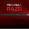
I like how the phone is in 1.
I like how the phone is in 1.
#91
pltctytc
-

- Members
-
- 26 posts
Member
Posted 16 December 2012 - 08:00 AM
quite frankly don't like any of them
perhaps #4 in red
perhaps #4 in red
#92
StealthFox13
-

- Members
-
- 125 posts
Gen. Member (Subject to change)
- LocationMinnesota
- Current Device(s):Droid Razr Maxx (Refurb), Galaxy Note 10.1
Posted 16 December 2012 - 11:40 AM
I really like the design of #4 it looks sharp, modern, and...well to put it plainly, sexy! ;-) however, is there any way we can chat with the creator about maybe making the font more readable? other than that, gorgeous. It's awesome that we have so many people willing to support this site. I love it and I love that we have the resources that we have. congrats to the creators of these logo's and good luck to all!
P.S. Color choice. I choose blue cause I would love to be as distanced from Verizon as possible. :-)
P.S. Color choice. I choose blue cause I would love to be as distanced from Verizon as possible. :-)

#93
jtc303
-
- Superuser
-
- 406 posts
Droid Master
- LocationMA
- Current Device(s):Droid Razr Maxx HD, Samsung Galaxy Tab 2 10.1
Posted 16 December 2012 - 11:45 AM
I agree with blue, considering most people are on ICS/JB and blue is the primary color of those... or green to match AndroidI really like the design of #4 it looks sharp, modern, and...well to put it plainly, sexy! ;-) however, is there any way we can chat with the creator about maybe making the font more readable? other than that, gorgeous. It's awesome that we have so many people willing to support this site. I love it and I love that we have the resources that we have. congrats to the creators of these logo's and good luck to all!
P.S. Color choice. I choose blue cause I would love to be as distanced from Verizon as possible. :-)
#94
Thach
-
- Administrator
-
- 2,364 posts
Motorola Fanboy
- Twitter:thach2639
- Google+:Thach26
- LocationGrand Forks ND
- Current Device(s):OG Droid, Droid X, Droid X2, Droid Razr, Droid Bionic, Droid Xyboard 8.2, Nexus 7
Posted 16 December 2012 - 02:53 PM
I think what we have in store is better than any suggestions so far. Stay tuned 
Sent from my DROID RAZR using Tapatalk 2
Sent from my DROID RAZR using Tapatalk 2
#95
Guest_BDH_*
Guest_BDH_*
-
- Guests
Posted 16 December 2012 - 02:58 PM
I think what we have in store is better than any suggestions so far. Stay tuned
Sent from my DROID RAZR using Tapatalk 2
??????????
- StealthFox13 likes this
#96
dubsx
-

- Superuser
-
- 400 posts
Droid Master
- Twitter:dubs_x
- LocationThe OH
Posted 16 December 2012 - 04:34 PM
boom goes the dynamite.
Sent from my XT912 using Tapatalk 2
Sent from my XT912 using Tapatalk 2

#97
Jcubed
-

- Members
-
- 131 posts
Android Rescue Squad Leader
- Google+:lovethelordjjj@gmail.com
Posted 16 December 2012 - 10:51 PM
whaaat??

working to provide the best assistance to you and the entire droid razr community improve!
#98
kent_lkc
-

- Superuser
-
- 5 posts
Firmware Team
Posted 18 December 2012 - 02:49 AM
I voted for #2 but actually I like the first one.
#99
TerriM
-

- Members
-
- 7 posts
n00b
Posted 18 December 2012 - 07:59 AM
I voted for #4, it looks great in both colors!
#100
VantenKiest
-

- Members
-
- 668 posts
Guru of Insanity & Tech support
- LocationPittsburgh PA baby
Posted 18 December 2012 - 07:28 PM
Wow only about 620 members have voted so far out of the what.. 32k we have.. come on guys start voting
In my Ferocious convictions, and in-dominant belief in my own actions, it would be a great advantage to anyone's interest who lay with mine..... Vanten Kiest


Also tagged with one or more of these keywords: All Members Please Read, Contest, site logo
RaspberryPi →
RaspberryPi Projects →
RPi Foundation $10,000 contest - Great Project for video codersStarted by Malakai , 09 Mar 2014 |
|

|
||
 |
DroidRzr.com →
Contests, Giveaways and Raffles →
Who wants a Nexus 5?Started by Staf_in_Wah , 01 Nov 2013 |
|

|
|
|
|
DroidRzr.com →
Contests, Giveaways and Raffles →
ROKU II XD - One Day Raffle StyleStarted by livinginkaos , 13 Dec 2012 |
|

|
1 user(s) are reading this topic
0 members, 1 guests, 0 anonymous users

